
BACK
Jing Chaun Child Safety Foundation (2019) indicated that preschoolers (2-6 years old) were the main users of parks, usually playing at playgrounds. However, the playground signs in aimed at warning children on what not to do are primarily text-written in Taiwan, which means young kids find it hard to understand the meanings of signs, especially for preschoolers who have not learned many words yet.
The picture shows that a common park signs in Taiwan (photo credit: me)

The research produced seven pictograms designed for playground signs based on preschoolers' cognition. These pictograms not only met the minimum recognition rate outlined in ISO 7010 (66.7%) but also attained an impressive average recognition rate of 92%.

Defined the research target, research limitations, and design process.
Utilized drawing experiments to observe and understand how preschoolers perceive and interpret pictograms.
(1) Semi-structured interviews: gained in-depth insights and revised the process of drawing experiments.
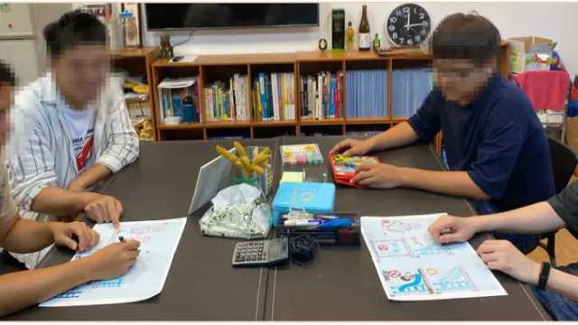
(2) Focus groups: produced pictogram designs based on children's cognition.
Employed questionnaires to evaluate the pictograms' recognition and preference rates, helping the iterative design process.
Based on different mobile operating systems, I developed iOS and Android versions. However, providing a consistent user experience was difficult due to their various components and behaviors.
• Many studies have shown that children are not able to identify them (Schneider, 1997; Kin Wai Michael Siu, Mei Seung Lam & Yi Lin Wang, 2017).
• ISO defined a pictogram design process: General analysis → Design development → Test
• Due to different cognition, Kalsher and Wogalter (2007) mentioned that people should design pictograms for children particularly.
• Lowenfeld’s theory indicated that 4 to 7-year-old kids can communicate with other people by drawing, helping people realize their thoughts.
Jing Chuan Child Safety Foundation (2019) indicated that 2 to 6-year-old children are the primary users of parks. However, there have been many accidents and severe accidents in the playground.
Most signs in playgrounds are designed for caregivers, hoping to remind children. Nevertheless, according to CNS 12642:2016 (A1043), the policy mentioned that users should include children.

In Taiwan, the age range of compulsory education is from 7 to 18 years old. Regarding the children's cognition development and based on Lowenfeld's theory - preschematic stage, the limitation is focused on 4 to 7 years.
Due to various user interface designs, developers spent time on implementation and maintenance, but the outcome was not ideal.
In the past, the UI specifications were of different qualities and not regulated, making the collaboration among product managers, designers, and engineers difficult.

Based on ISO 7010 pictograms, this research collected seven pictograms and categorized them into three sorts:

Through a literature review to organize an initial process, this research conducted a semi-structured interview of two teachers in Jing-Xin kindergarten to modify a process based on their experiences and pieces of advice.

Thus, the process of pretests: introduction → drawing and observation → interview. However, after pretests, the process was modified due to the observation. For example, this study found that children could not remember details well. Therefore, if people ask a child why you drew this object, he or she might not answer reasonably and adequately.

Jing-Xin kindergarten (New Taipei City)
09/27, 10/31, 11/01, 11/07, 11/08, 11/15, 11/19
Three boys and nine girls
*Parents should allow children to join this experiment. Moreover, teachers selected children who were more willing to share.

▲Thanks to all the lovely participants 🥰
I gained 59 paintings in total. For each pictogram, this research selected two to three common elements in thier paintings. For example, in the "line up" pictogram, children loved to draw (1) Figures and (2) Facilities.

▲ Preschoolers presented the "Line up" pictogram.
Furthermore, I analyzed preschoolers’ works according to four categories (shape, figure, space, and color).


All participants equipped at least three years design experience, and the age average was 20 to 25 years old. They were willing to share ideas and good at express their feelings and communicate.
(1) Drew the images individually and then found common features.
(2) When team members had differences of opinion, they took a majority vote to define the style and final pictograms.
(3) During the design process, it was difficult to decide which image was better in “If there is any defect on the facility, please notify.”, so members drew two pictograms.
(4) Members all recognized that it was not easy to transform preschooler’s cognition into pictogram design.


(1) Discussed common features.
(2) They designed two sets of pictograms because they would like to convey different styles.
(3) Members advised that each pictogram should put it in the proper position instead of presenting on a board.


(1) Discussed common features.
(2) One of the members was a graphic designer and illustrator. Therefore, she was responsible for all design.


Random sampling survey (online)
Fifty-five questionnaires were collected; the final number was forty-four valid questionnaires, excluding invalid questionnaires.
Preschoolers who were over four years old but under seven years old), and parents could assist them.
Sex / Age / The frequency of going to parks (a week)
Which pictogram is the most suitable one for the meaning?
Among four sets of pictograms, which style is the most favorite one?


As the chart illustrated, 72.2 % (32ppl) chose the style of the first group, and the three main reason was: (1) Cute (2) Simple and understood easily (3) Vibrant color used

Furthermore, some parents gave pieces of advice by observing children’s reactions:
• Their children would recognize “prohibition” pictograms according to figures’ facial expressions, especially sad or angry faces. Thus, it would be better if “prohibition” and “warning” pictograms followed this rule.
• “Do not jump from the facility” should be more precise, emphasizing the jumping action.
• It would be better if prohibition symbols became bigger.

• Unified the style that was more like the first group presented.
• Made all colors brighter and more vivid to fit preschoolers’ preferences.
• Modified the size of prohibition symbols and their positions, helping children recognize pictograms faster and easier.
• Used arrows to emphasize the objects.
• Facial expressions could present the concept of prohibition.
Sex / Age / The frequency of going to parks (a week)
Bo-Ren, Xue (2008) organized seven methods to evaluate pictograms. Considering that preschoolers easily forget content due to too much information, this research applied “matching” to this survey.
Preschoolers who were over four years old but under seven years old), and parents could assist them.
Fifty-one valid questionnaires were collected. Furthermore, the method and the respondents' limitations were the same as in the first survey.


Based on the design process: research (drawing experiments) → design (focus group) → evaluate, this research would provide conclusions in this part. I hope that will benefit future research.
With teachers' advice and observations in drawing experience, this research found that preschoolers were easily distracted or forgot messages. Hence, simplifying the meaning and using the most basic words to explain to them were better. That would help the researcher achieve their research more efficiently.

According to children's cognition, this part indicated general design rules that can apply to other pictogram designs, sorted into four categories.
• Use common facilities, such as slides, to present a playground.
• Instead of putting a full-out prohibition symbol, designers could place symbols beside objects or actions that preschoolers should not be allowed to do.
• Utilize facial expressions to convey messages to children. For example, figures in warning and prohibition signs could be sad or angry.
• Design figures in a simple style.
• Draw a simple line and the sun as the baseline.
• Do not have to contain complex perspective concepts in pictograms.
• It is easy for children to understand by only drawing the front sides of objects.
• Use inherent colors in drawing nature and some abstract concepts (permission: green; prohibition: red)
• Design objects in pink, blue, and yellow, which are the most frequently used colors in children's paintings.
According to the results of the questionnaires and feedback, preschoolers prefer cute, simple-structured, and using vibrant color pictograms. Therefore, this research suggests that designers could produce pictograms in this style.
Because it is hard for children to process much information at once, I modified the "matching method", making it simpler to fit their cognition. Specifically, instead of giving all messages once, it is better to provide one message at a time. A child just needs to match a meaning to one pictogram, just like a multiple-choice question with only one correct answer.

▲ A featured park in Taichung, Taiwan
(https://reurl.cc/bD5x6d)
This research focuses on standardized playground equipment. However, considering the diverse range of parks in Taiwan, including featured and inclusive playgrounds, researchers and designers are encouraged to adapt the structural framework and design process from this study to create varied pictograms for different park settings.

▲ A common sign on a facility. (photo credit: me)
This research specifically focused on developing pictograms for implementation on signage. Thus, subsequent researchers and designers can consider the optimal positioning of individual pictograms on the facilities, taking into account children's visual range to enhance their appeal and effectiveness.
Generating a user-centric product is difficult, especially since the target users are preschoolers. However, it was definitely a precious experience for me to enhance and solidify my design research abilities. From problem framing to conclusion, I learned how to define the structure of my thesis, organize every piece of literature, and finally built my design process to produce pictograms.
Moreover, executing tons of drawing experiments was a really delightful memory (thanks to every kid who participated in experiments; you guys are angels 💕). After gaining more profound insights into preschoolers' cognition, I could combine their thoughts and feedback with what I obtained in literature reviews to produce a general design guideline for designers, improving my logical thinking skills significantly.
Last, thanks to everyone who gave me a hand, provided valuable advice, and joined my survey and design group. Love you all!
Due to my original thesis doing lots of literature review, it will be too long to list every reference here. Therefore, you can download the PDF file below to check if you want to see it.
自由時報(2019)靖娟:北市 8 城公園設施限 6 歲以上,幼兒受傷不負責。資料來源:https://news.ltn.com.tw/news/life/breakingnews/2381285。查閱日期:2019 年 6 月 13 日
薛博仁(2008)。台灣高速鐵路車站公共指示性標誌認知之研究—以台中站為例。(未出版碩士論文)。國立雲林科技大學,雲林市。
ISO 7010. (2023, November 23). Wikipedia. https://en.wikipedia.org/wiki/ISO_7010
Schneider, K. C. (1977, September). Prevention of Accidental Poisoning Through Package and Label Design. Journal of Consumer Research, 4(2), 67.
Siu, K. W. M., Lam, M. S., & Wong, Y. L. (2017, March). Children’s choice: Color associations in children’s safety sign design. Applied Ergonomics, 59, 56–64.
Kalsher, M.J., Wogalter, M.S., (2007). Warnings: hazard control methods for care-givers and children. Ergonomics for Children. Taylor & Francis,New York, 509-539.
Heilman, H. F., & Lowenfeld, V. (1952, May). Creative and Mental Growth. Art Education, 5(3), 14.
