
BACK
VORTEX is a cloud-based surveillance platform (VSaaS) by VIVOTEK providing seamless, centralized monitoring across multiple locations.
I designed essential UI elements and partnered with the UX team to refine flows and hierarchy, ensuring that complex surveillance operations became more intuitive and efficient for enterprise operators.
UI/UX designer
Team|Wen-Chun Chen (Lead), Yu-Feng Huang, Verna Hsu, 5 Development Engineers
Competitor Analysis & Report
Design Guideline
Specification & Handoff
Component Library
Dec. 2020 - July 2023
VORTEX is Taiwan's first cloud-based VSaaS (Video Surveillance-as-a-Service) product, tackling surveillance issues with AI detections and providing users with a better monitoring experience.
In this project, UI team aimed to produce an intuitive and well-organized user interface design for customers, increasing their productivity.

Let's talk about VIVOCloud first, which was the original version of VORTEX. Our team identified several problems with this old product:

Some sales reps mentioned that our design was not intuitive for users, according to feedback. Also, they were NOT responsive.

VIVOTEK rebranded in 2021. VIVOCloud did not fit our new brand image, causing users in an inconsistent user experience and brand visual.

As a surveillance product, the way presented information organization was crucial. But, it was clear that VIVOCloud did a complex sorting, increasing user errors.
VORTEX should align with VIVOTEK design system and our brand image, creating a brand-new and consistent user experience and interface design for our end users.
Developing a user-centric digital experience is our core value. As a surveillance software, users have to deal with many data, so it is the most important goal for our design system, helping them increase productivity.
My role as a UI designer in this project:
・I was responsible for the mobile version UI design.
・I established a mobile version component library in dark and light mode according to VIVOTEK design system.
・I cooperated with the dev team and QA team, ensuring the whole implementation were based on our design documents.

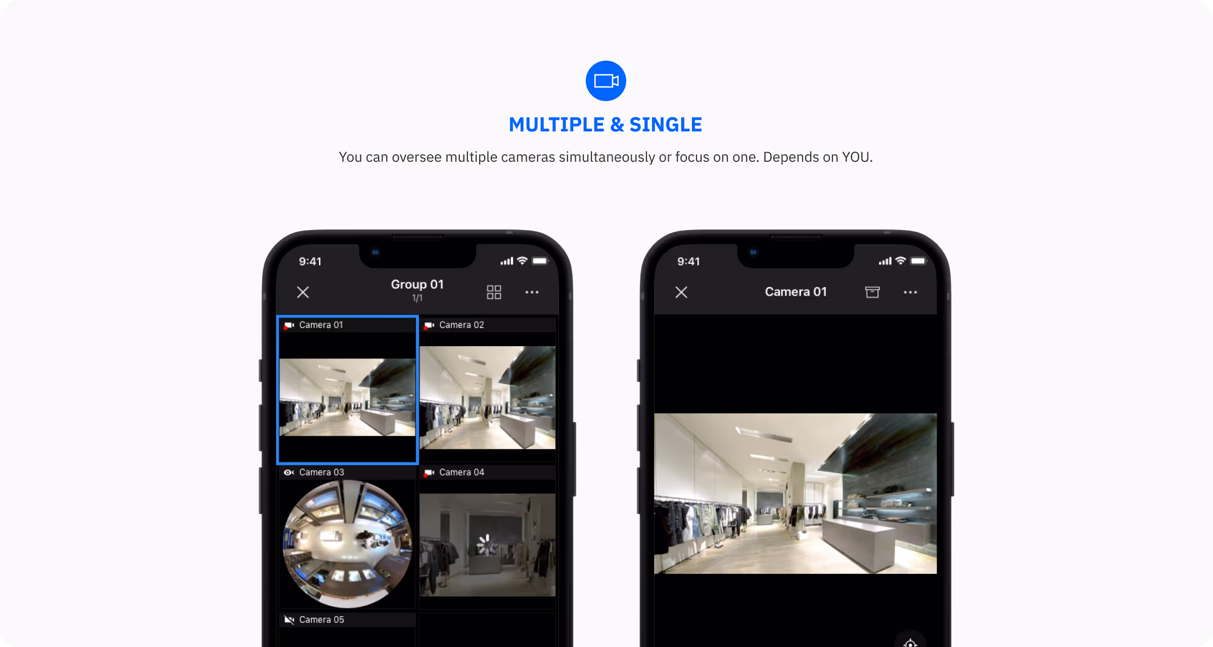
Served as surveillance software, a streaming panel is one of the most important functions. Furthermore, VORTEX would offer our users a 16CH (channels) service, which means you can monitor 16 cameras at once, maximizing productivity.

We defined control panels (expanded and collapsed states). Then, we tried many sizes of streaming screens from 8CH (the smallest streaming screen) to 1CH, ensuring the whole GUI was reasonable for different situations.
After we defined all panel sizes, PM said that they wanted to implement 16CH functions for all users. Thus, we recalculated everything. What a wonderful experience.☺️

For font size, we normally used "body" to indicate devices' names. However, for better streaming screen display, we chose "caption" as title. Users can experience a bigger streaming screen for 8CH or even 16CH.

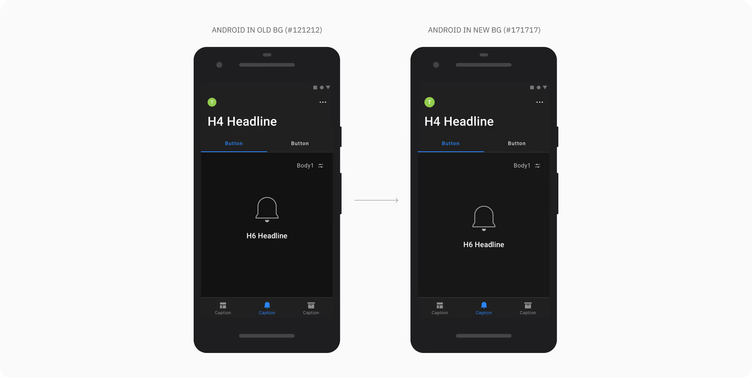
For the landscape version, the nav bar and the control panel would cover streaming screens. We decided to choose a transparent color (#121212, opacity: 80%).
In this project, UI team aimed to produce an intuitive and well-organized user interface design for customers, increasing their productivity.


To align with iOS and Android interaction guidelines, I provided two design files for the dev team. Initially, we used two colors—#121212 for the first layer and #171717 for the modal background—to distinguish information levels based on the iOS modal stack.

Although these elements shared the same level in the information architecture, differences in color definitions and the iOS modal stack led to varying color-surface tokens. This inconsistency confused reviews by the iOS and Android dev teams, as well as the QA team, who questioned why surface colors were not aligned across platforms.

I audited all pages with the modal stack and confirmed information hierarchy with the UX team. Then. I asked the QA team to get insight from users. After ensuring, I realized that the stack modal could truly convey the information hierarchy. Color layers were not necessary for users.
Moreover, in Material 2, surface color definitions don’t heavily emphasize layering; instead, shadows and lines are used to separate information. Therefore, I plan to simplify the definition of color surfaces.

I deleted the color of the first layer, merging it with the modal background color. In this way, users would not be confused if they used different operation systems and let our color definition become simpler


Based on feedback from our sales reps, our users primarily rely on low-budget Android phones for work. I set our iOS artboard to 390x844 (iPhone 12, default artboard) and the Android artboard to 360x640 (the smallest screen resolution).
The below image showed how I defined UI grouping for the dev team.


To simplify our problems, we audited all options and organized them into different categories. That helped us to deeply understand how many components we need for creating new card modules.
After surveying, I organized three artboards for iOS and two for Android.


For iOS, I considered the size of the home indicator and the dynamic island; choose a general size of logo (200*300) to fit all screen sizes. On the other hand, I referred to Android 12's guidelines, creating a common rule for both Android artboards.
Then I label grouping rules and sizes on the artboards.


Understanding how to cooperate with the dev team was a lesson for me in this project. I learned more about CSS to better communicate with the dev team to achieve the design goals.
Besides, the way of writing design handoffs is crucial for implementing. If the dev team can't understand what design effects I want, the demo would be a disaster.

First, the naming structure of components in our mobile design library is still a little bit messy. In the future, I hope to redevelop a naming rule to further the structure. In addition, we followed the previous version of iOS and Android design guidelines; maybe we can update ours, too!
Create a new and seamless web and mobile UI experiences for VIVOTEK surveillance products, establishing a professional brand image.
