
BACK
Path@Penn is a course registration platform for UPenn's students. However, its terrible UX/UI design makes users mad. A bunch of questions appear on Reddit during the registration process.
Comments commonly note concerns such as a confusing interface and an unintuitive workflow for important tasks like choosing a course and managing a schedule.


The main user experience of adding courses in Path@Penn is searching. After searching, students can select the section that they want to take (sometimes they have to send course permission to the professor).

Based on user feedback, I concentrated on "adding courses" and "course searching" to enhance Path@Penn and make the registration process easier for students to have a better user experience.

Based on the research by NNgroup, there were 5 people, including me, to do a heuristic evaluation.

I did interviews with 3 students (2 graduate students and 1 undergrad student) to understand their needs. Then, I organized their comments and did affinity diagramming to gain key insights.

According to the previous research and an affinity diagramming, I identified the main issue in Path@Penn and generated HMW to narrow down the project scope.

Based on previous user insights, I gained the three main values of Path@Penn: Efficient, Intuitive, and Responsive.

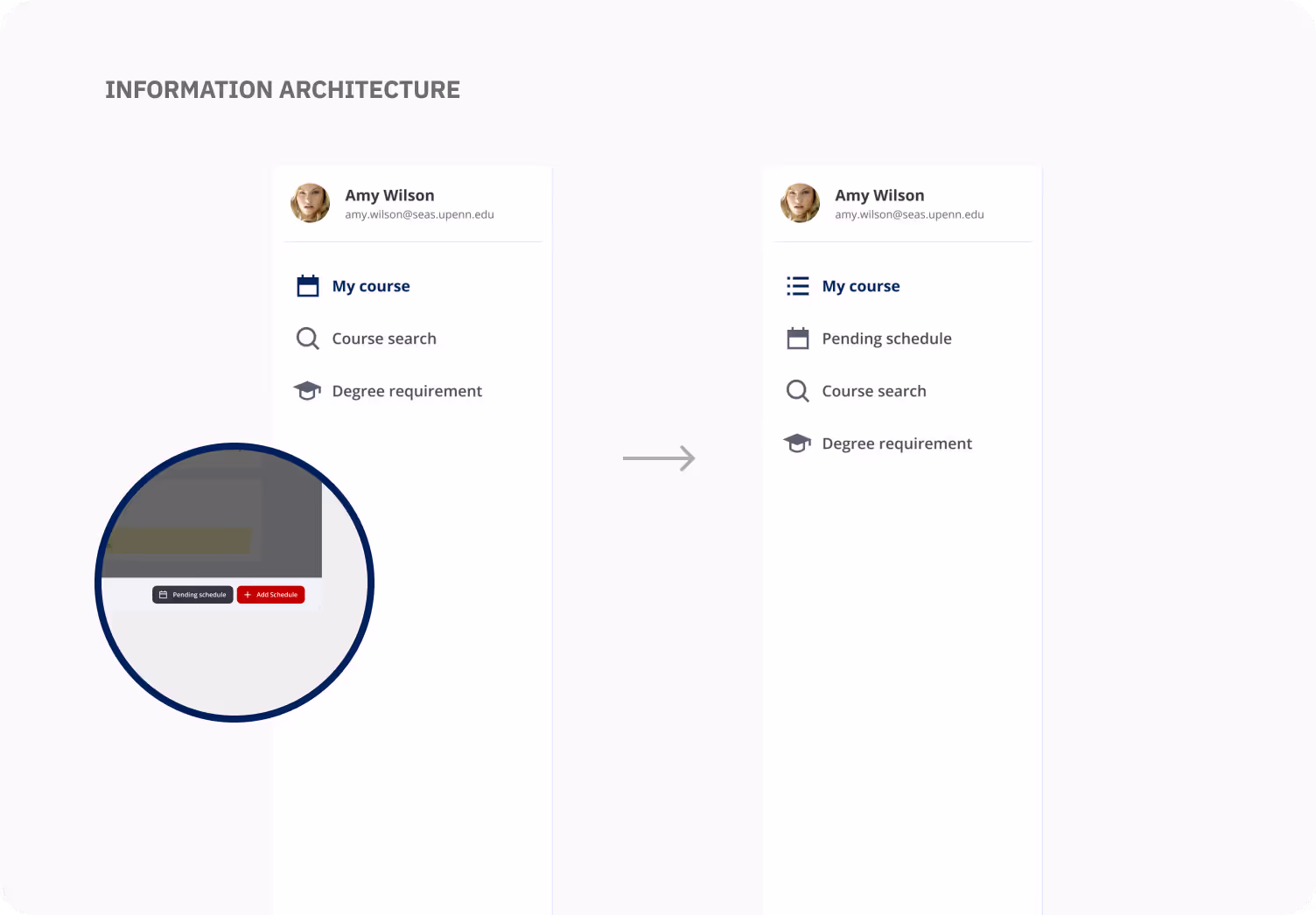
I want to simplify the course registration process. Also, I reorganized the information architecture, adding a section for students to check course status.

I created wireframes to confirm my first version of Path@Penn. Then, I conducted three usability tests to modify my current design.

Three users participated in the first usability test to provide me their feedback, while I observed the whole testing process.
I want to understand where users expect to find the course selection feature, perform a course swap, and submit their final schedule.
You’re planning to enroll in the course ‘User Experience’ for the upcoming semester. First, locate the section where you can select this course. After adding the course, swap it with another course, and ensure it’s added to your schedule. Finally, submit your final schedule

• Nine users participated.
• The participants were asked to complete the selecting course task using Path@Penn, while I observed, took notes, and asked for feedback.
• After testing, they would take SUS to better evaluate.
• I gained 84.72 in the SUS test, which means my product is acceptable for users!
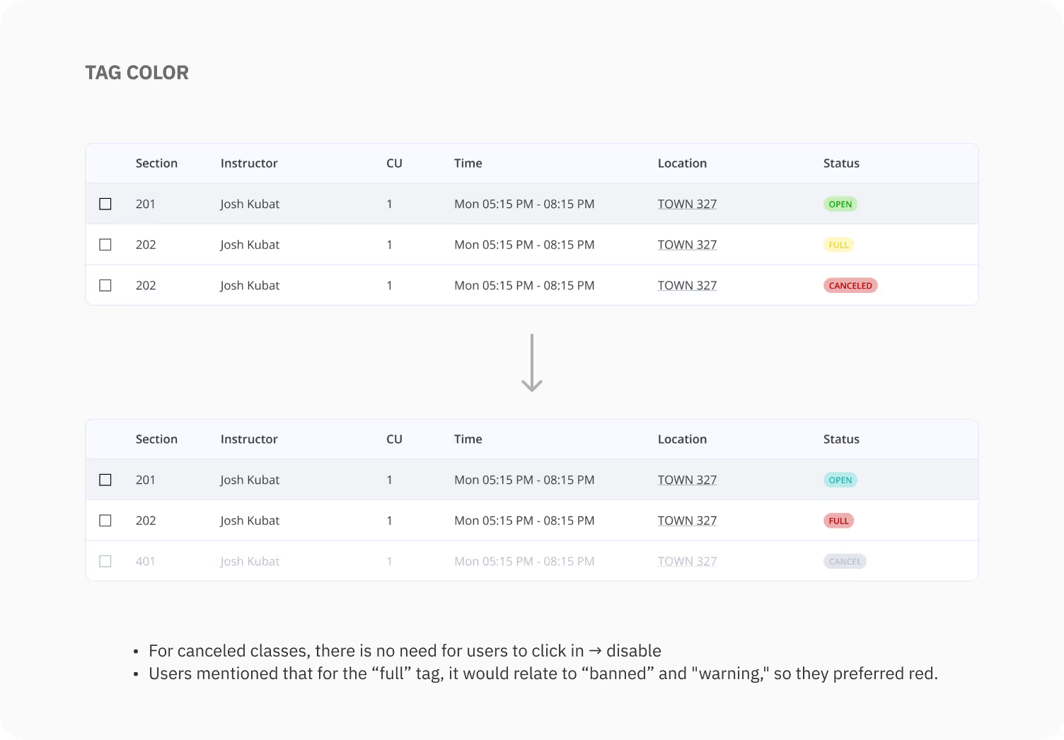
According to users' feedback, many of them indicated that they preferred to check a pending schedule back and forth, ensuring all courses were not in conflict.
As a result, I change the hierarchy of "pending schedule," making the whole process more convenient and intuitive for users.


Even though I did a lot of research on the Net to ensure the problem, I think if I did a questionnaire (quantitative analysis), the whole result would be more comprehensive.

I've already designed the first version of Penn's visual style. The next step, I want to redesign Penn transit app and create mobile component library to organize Penn's design system.
