
BACK
Despite RADHawk’s rich resources, the tool often slowed radiologists during diagnosis. Through 30+ interviews and in-context workflow observations, I found that scattered content, unclear information hierarchy, and low relevance created cognitive overload and eroded trust.
The new RADHawk focuses on bringing clarity back to radiologists’ daily work. By streamlining how information is found and presented, it turns what used to be an overwhelming search experience into a focused, intuitive flow, which helps clinicians stay confident even in high-pressure reading rooms.
Reorganized content helped radiologists locate the right materials faster and with less effort. NPS improved from +11.8 to +80.
Enhanced visual hierarchy to clarify content types and relevance, reducing confusion and improving reading flow. CSAT increased from 64% to 93%.
Refined flows tailored to attendings, fellows, and residents streamlined access and supported different learning goals. Task success rate reached 100%.
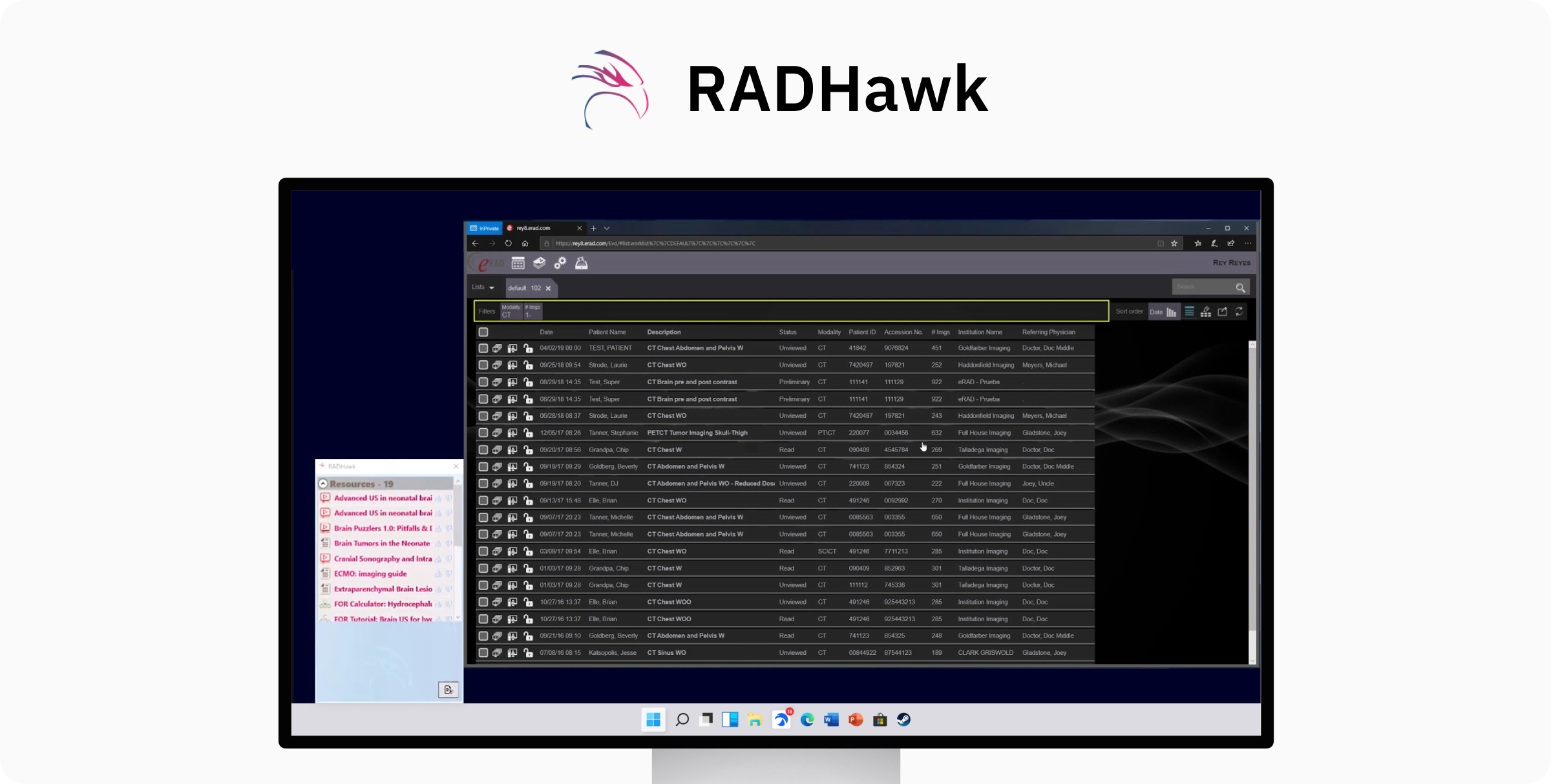
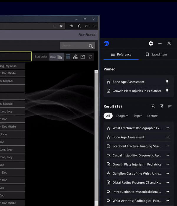
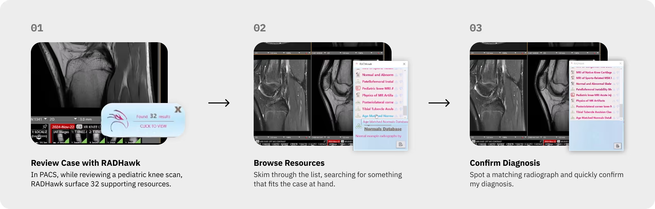
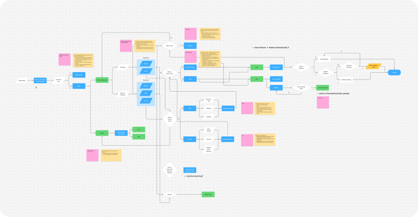
Before redesigning RADHawk, we first observed how it was used during a typical diagnostic session.
In this flow, radiologists relied on RADHawk to access diagrams, papers, and lectures that supported their diagnostic reasoning or teaching preparation:
We were initially asked to “refresh the UI.”
However, once we began examining how this workflow played out in real use, it became clear that the challenges went far beyond visual design.
After heuristic evaluation, focus group, interview, and questionnaire with 25+ participants, we realized the core issue was rooted in usability gaps. To accelerate our workflow, we leveraged ChatGPT to synthesize qualitative data, rapidly distilling core user pain points.
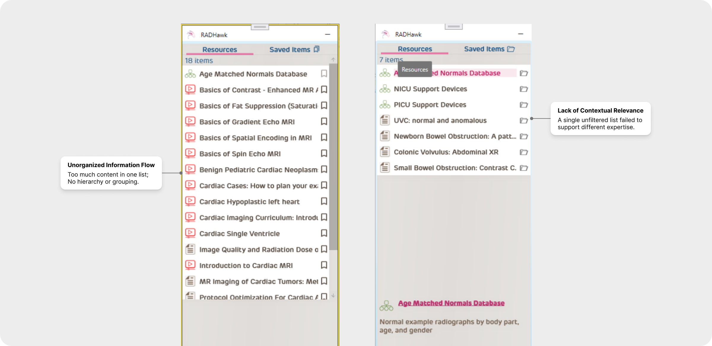
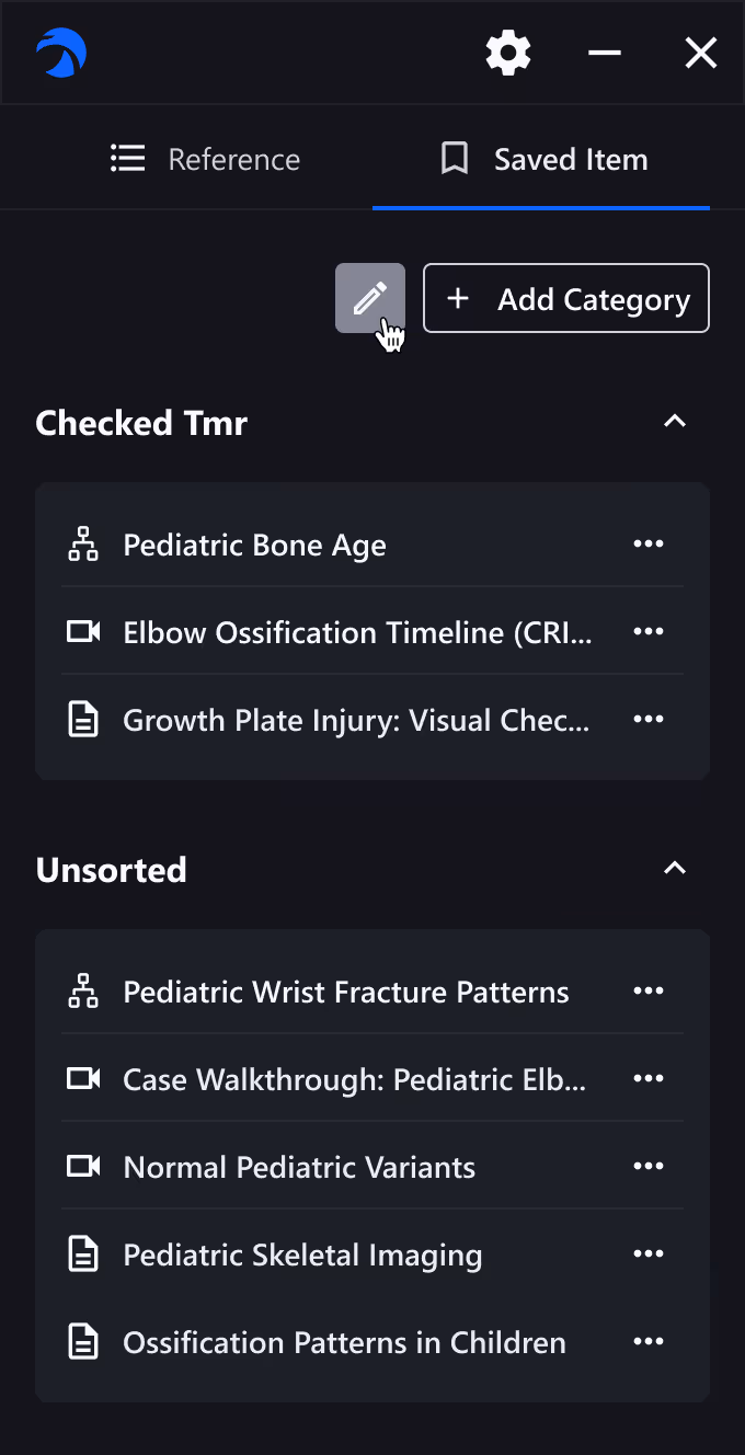
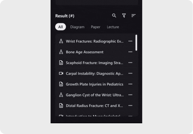
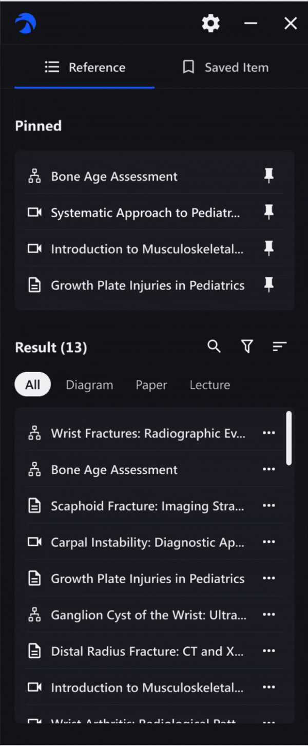
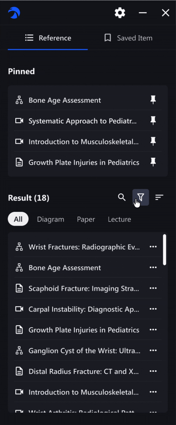
Resources appeared in long, unorganized lists, leaving users unsure where to start or what was most relevant.
Different expertise levels required different materials, but RADHawk treated everyone the same.
In a setting where radiologists review hundreds of cases a day, speed and focus are everything. But RADHawk’s flat list required extra searching and context switching. All small delays added up to workflow friction.
Our research revealed structural usability gaps that affected how radiologists worked. We reframed these insights into actionable opportunities and key interactions.
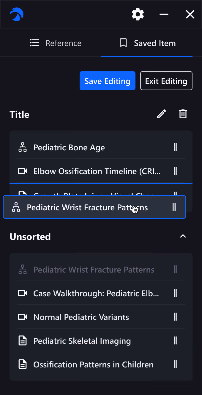
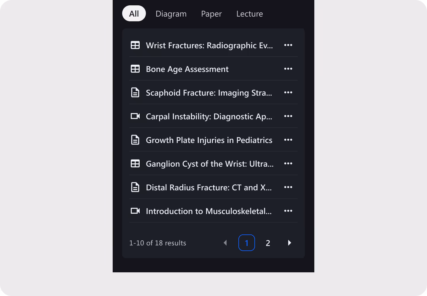
From scattered, ungrouped lists to a structured information flow to clear categories and visual hierarchy, we aim to help radiologists instantly locate the most relevant references without cognitive overload.
We designed adaptive content views tailored to expertise, enabling attendings to access quick references while giving residents structured materials for learning and review
We restructured navigation around their real clinical rhythm, reducing unnecessary steps and allowing them to find and confirm references within their diagnostic flow.
So, our design goal became to rebuild RADHawk around how radiologists actually think and work, not how content was originally stored.
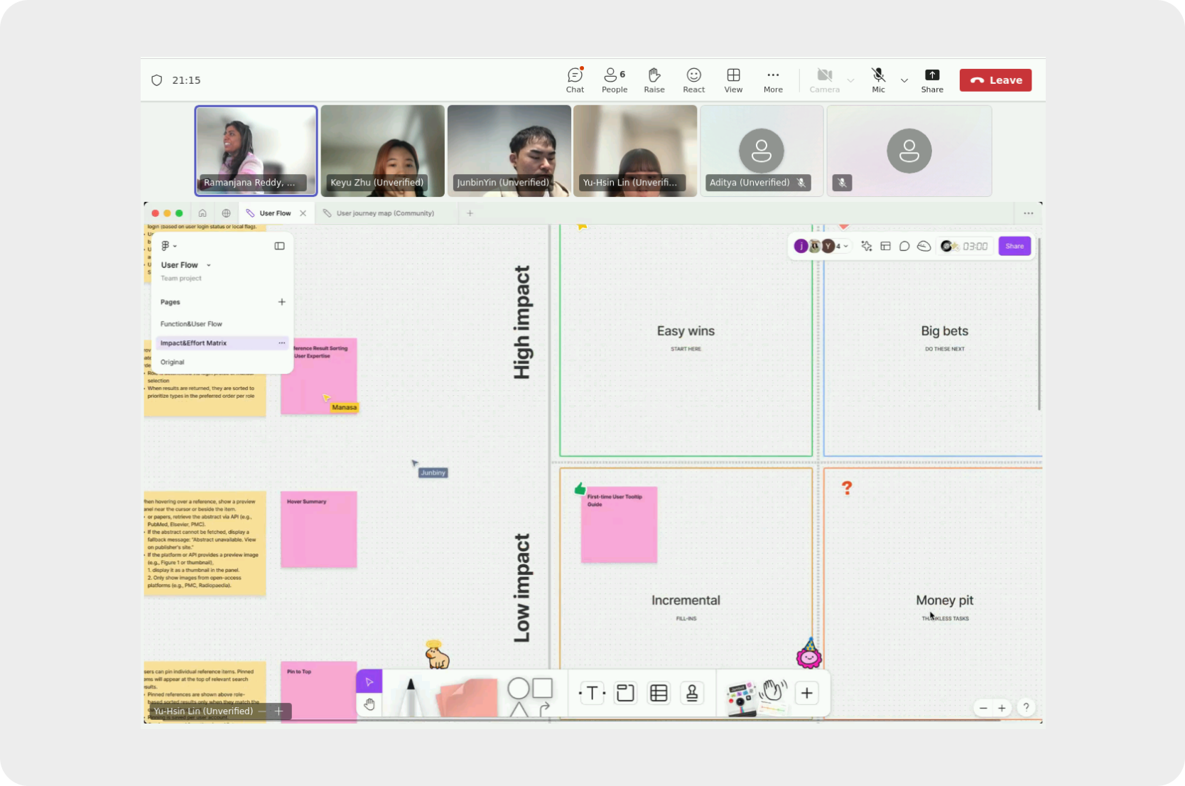
To bridge the gap between design ambition and technical reality, I facilitated a workshop with stakeholders. Using an Impact–Effort Matrix, I guided the team in navigating trade-offs, ensuring we focused on high-value features that were feasible for the engineering timeline.
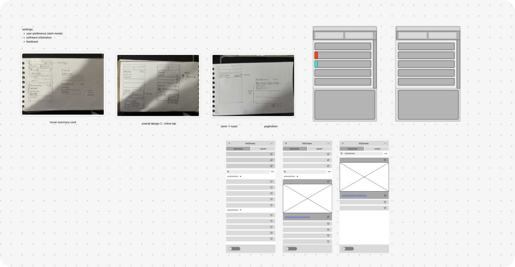
Then, I created early user flows and low-fidelity wireframes to visualize these prioritized solutions. Additionally, I utilized Claude for rapid prototyping, enabling us to validate technical feasibility early in the design phase.
After completing the first redesign, we conducted usability testing with 6 radiologists, including attendings, fellows, and residents, to validate clarity, navigation, and overall task efficiency in real diagnostic workflows.
• Assess how easily radiologists can locate and apply references using the new navigation structure.
• Validate whether the redesigned features feel intuitive and efficient across experience levels.
(1) Locate a relevant case reference for a given diagnosis.
(2) Pin it for future use.
(3) Return to confirm and compare references for a different case.
Radiologists were able to locate and pin references in seconds without confusion or hesitation.
In post-test feedback, satisfaction and confidence also rose notably: CSAT increased from 64 % to 93 % and NPS from +11.8 to +80. This result confirmed that the redesign addressed the core usability issues uncovered during research.
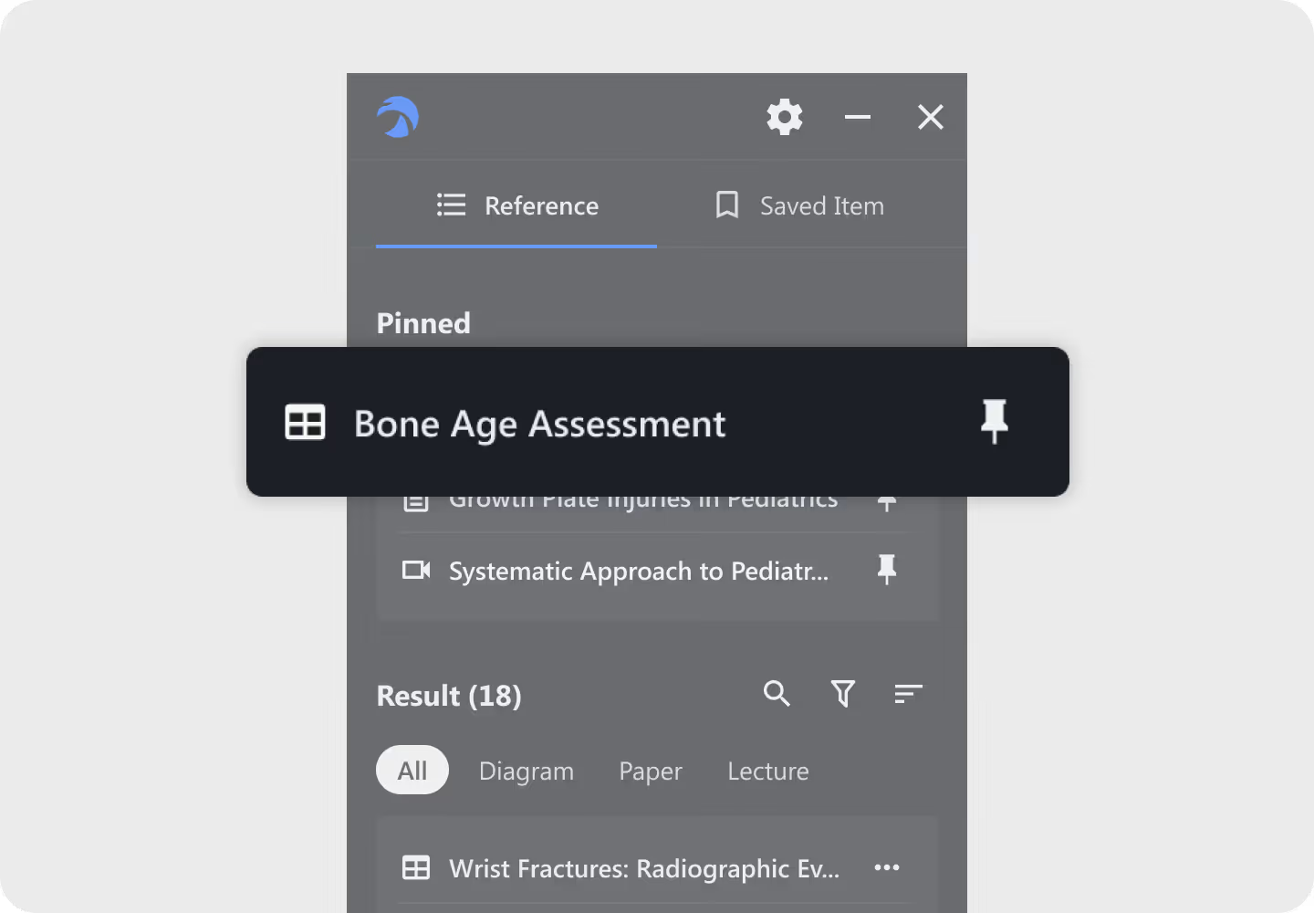
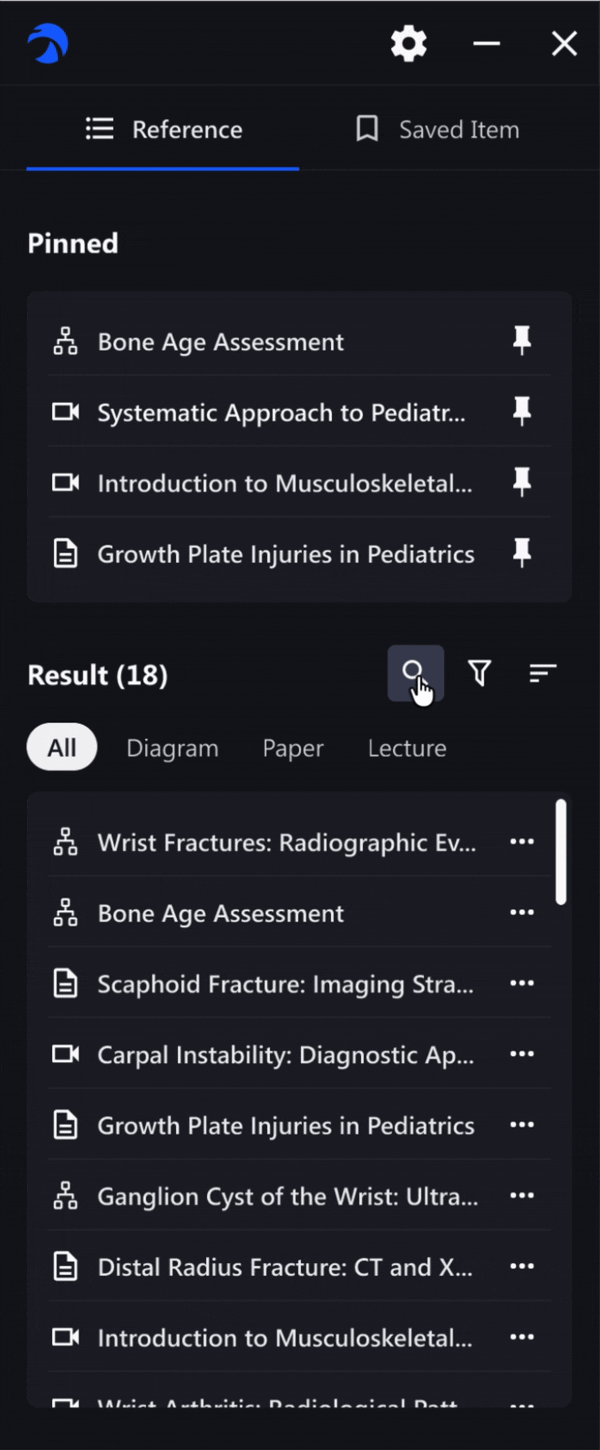
Initially limited the number of visible references to reduce cognitive load, but testing showed radiologists prioritized speed. That was the reason we adopted infinite scrolling to let them access information faster.
From user feedback, we found that most radiologists regularly reference 3–5 key materials during diagnosis. To support their workflow, I expanded the pinning limit and refined the layout for easier access to frequently used resources.

Since users were already used to the previous icon, I avoided redesigning it from scratch. Instead, I fine-tuned its proportions to make it easier to recognize.

Our default dark mode was designed to mirror the radiology reading room, a low-light environment where doctors spend hours reviewing cases. It reduces eye strain and maintains image fidelity, creating a seamless viewing experience.
For flexibility, users can easily switch to light mode when collaborating or teaching, empowering them to adapt the interface to their own workflow.
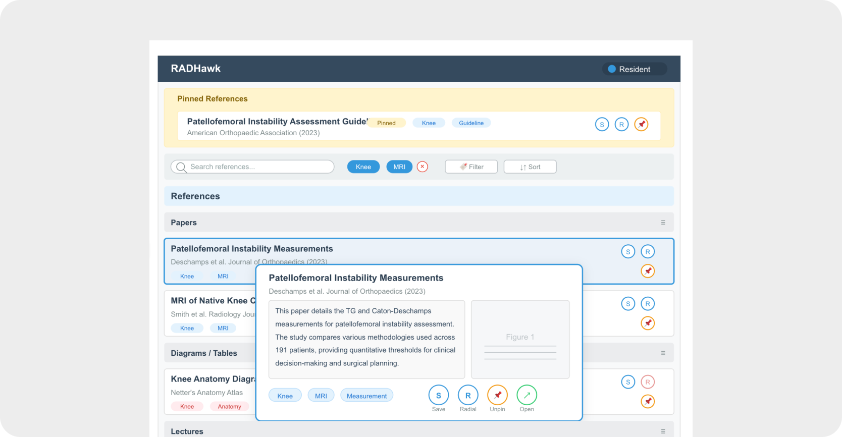
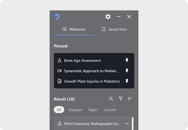
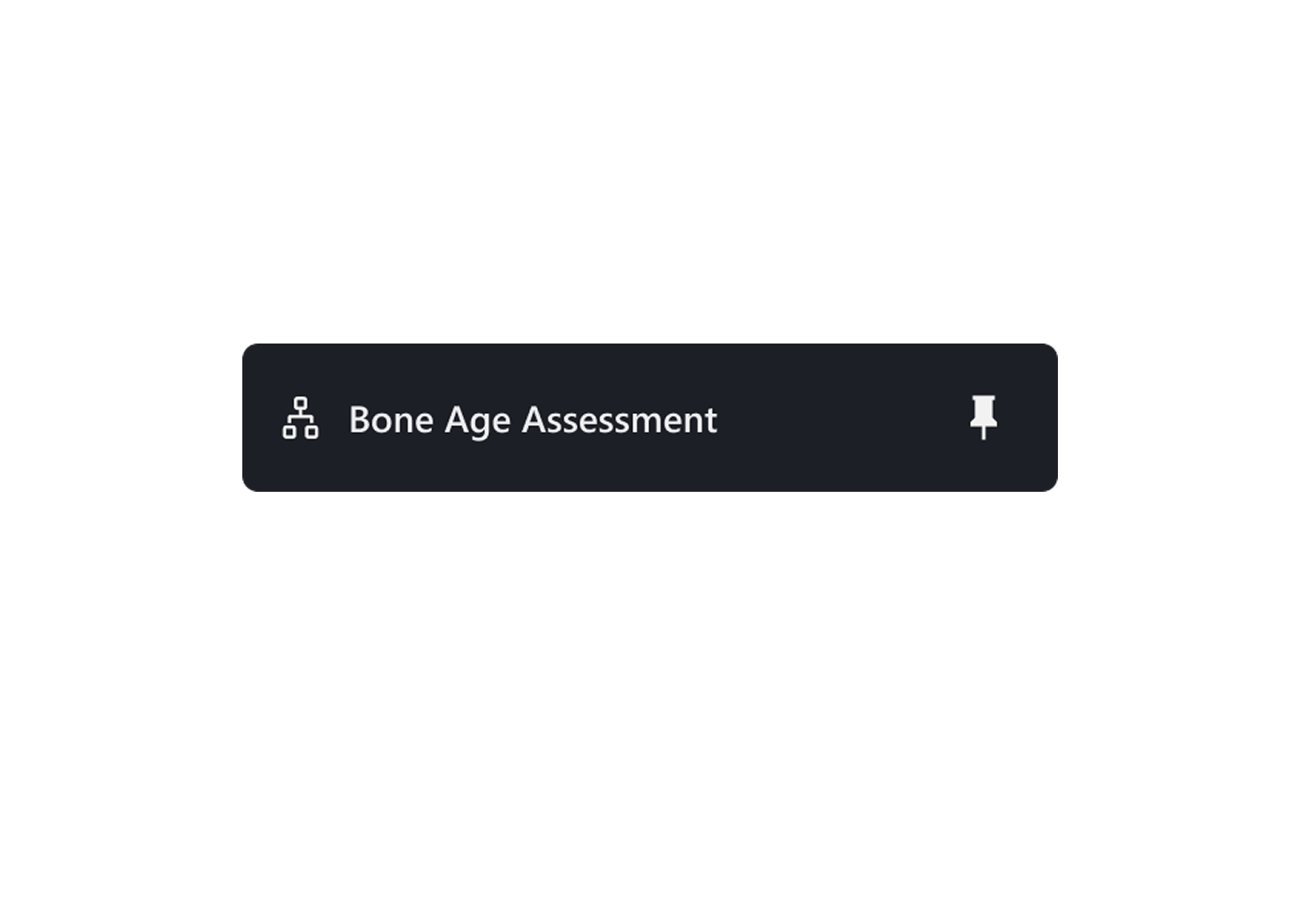
Frequent cases deserve instant access.
With RADHawk’s pinning feature, radiologists can keep their most-used diagrams and papers at hand, no repeated searching, no wasted clicks. It turns daily reference hunting into a seamless, one-tap workflow that supports faster, more confident diagnoses.
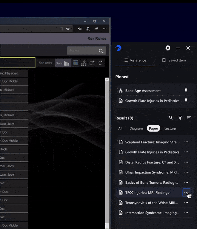
Finding the right reference shouldn’t slow a diagnosis. With contextual filters and search feature, RADHawk helps radiologists quickly surface the most relevant materials, whether they’re reviewing scans, preparing lectures, or mentoring residents.
Radiologists at different stages bring different needs: attendings look for quick visual references, fellows need structured case materials, and residents prefer guided lectures to build understanding.
To make this seamless, RADHawk combines tab-based categorization with data-driven sorting, surfacing the most relevant materials for each role. Users can also sort by Most Relevant, Most Viewed, Recently Reviewed, or A–Z, giving them flexible control over their workflow.
The new hover card replaced the bulky fixed-bottom panel. It surfaces key details and tags only when needed, helping users preview content faster. By providing quick, reliable information at a glance, the feature also builds trust in the system’s accuracy.

This was my first time building a product from the ground up. I learned how crucial it is to align early and often with the product owner and stakeholders, ensuring every design decision serves both user needs and business goals.
During interviews, I found that some features in RADHawk weren’t ideal, but users had already adapted to them. Instead of reinventing everything, I focused on tweaking designs around existing learning paths to reduce friction and respect users’ established workflows.

After launching the first MVP, the product will be piloted in several hospitals on the East Coast to gather more clinical feedback.With more usage data and field observations, we aim to refine the product further, turning early insights into improvements that better support healthcare professionals.
Designed and shipped VORTEX, Taiwan’s first cloud-based AI video SaaS, launched globally in 2022 and scaled to enterprise adoption across North America.
